Tuesday, 16 November 2010

Final Prop Design

For my finaldesign i did a couple of sketches of some ideas. I then drew out a side top and bottom view of the final design and took it into photoshop and coloured it with some leather and golden patterns:


 This is the design of the final show. I placed a large golden plate at the front of the shoe in an art deco shape. This is because the gun will be fire by flexing the foot and pushing the pressure points at the front of the shoe underneath the toes. It will also allow a larger surface area as walking on a gun heel is going to be difficult. To compensate, i added a wedge before the plate to balance out the persons body weight across the shoe and prevent the gun from constantly
firing.


This is the finished shoe once i had coloured it in photoshop. I have drawn it and coloured it from top and side angle. I absolutly loved this prop. I would love to make it in maya as i personally think it is a really awesome idea!

Tuesday, 2 November 2010

Shoe and Gun designs

I found pictures of current fashion shoes. i chose my four favourite designs so that i could develop the prop alongside these drawings,


 Out of these shoes my favourite was the boot. i like its shape without the leg coverage so i will most likely use this as my basis


My favourite  of the guns was this one on the left. I like its decoration and its old fashioned style. This is the gun which i will combine with the shoe for my prop design


Friday, 29 October 2010

Development

This week i carried on developing my project ready for my entry new week and show sam my work and get some tips before i post them on the blog...sorry :) no work todayyy!

Photoshop

I experimented with these prop ideas and photoshopped some combinations to give me some more inspirations


Here i combined a pair of glasses with a gun barrel. I liked this idea as it would allow for lots of strange designs and fashionable glasses are very modern which would work perfectly with what i intend to achieve.

Here i combined gloves with a knife and gun (as the thumbs) i was least keen on this idea but i designed it as development towards the final idea. At least i explored it! :) 

This was another one of my favourites. I combined a watch with ninja-star like blades. The design was really funky, however, practicality issues would mean that it would probably be very incomfortable to wear and use so i scrapped this idea.

Here i combined an umbrella with a grenade to create a missle/timer grenade. I did like this idea but it was to similar to the penguins umbrella from batman so i decided not to follow this idea.


This was definatly my favourite. I got the inspiration for this when i was watching planet terror and the main character gets her leg cut off and replaces it with a machine gun. Obviously i could not design an organic leg so i thought about combining modern shoe-wear with a gun as the heal which could be activated much like the shoe-blades spring mechanism that i saw in the royal armoury. This is the idea i want to follow for my prop!

Thursday, 28 October 2010

Prop design research

I did some research into popular clothing and weapon combinationsto help me get some inspiration for my prop design

 
 The blade being part of a bracer and glove. This is most famous for being in the new game series assassins creed, but was actually a venician weapon.


 The shoe blade has been around as a weapon since early japanese armour and weaponary. It orginally had a pressure spring mechanism that was attatched to the feet of samurai for close range combat.


The penguin in batman has an umbrella which is a multitude of deifferent weaponary. It is a gun, can expell different deadly gases and conceal a blade in the frame. It is a very exagerated but impressive weeapon idea. This was my favourite of the examples i found.
 
Prong gloves where a popular weapon within china within the 220 - 265 C.E (The Han Dynasty) it was a set of blades attatched to a glove-like gauntlet. it looks alot more intimidating than the damage it would actually produce which was one of the reasons that it phased out, however i think its a very decrotive and impressive weapon design.

Royal Armoury

Here are a few drawings that i did from the royal armoury. I have chosen my best ones. I thought that it was a really good trip. I do find weapons quiet interesting and the assignment sam gave us was to create a prop combining some wepons or props. She said that the royal armourys are perfect for inspirations and this was true. Aside from the usual wepons, there were some very strange ones such as elephant armour which i drew and historical chinese shoes with blades built into the sole.


My favourite of the drawins is the elephant armour. Its so unique and wierdly shaped i had to draw it. I drew some of the tradiotional weapons aswell like a pistol and sword etc. just so i could familiarise myself with the shapes better. I liked the idea of merging some modern day clothing with some old styled weapons at the armoury. Im going to develop this idea as my prop design.

Daisuke Ishiwatari

Here is a small presentation on the artist behind the Blazblue and Guilty Gear games. We choose him as our favourite artist mainly for his unique character designs and detailed art work.


Daigo Ikeno

Daigo IkenoBy Elisha Brown
For my artist I choose Daigo Ikeno, he is an artist for the games company Capcom that has done concept and character designs for twelve games (1) including his most recent work on Street Fighter 4 and Dead Rising. I came across Ikeno when the latest Street Fighter game (Street fighter 4) was released, the art style was so unique with such attention to detail so I researched into what he’s influences were. I found that he used the style of Japanese ink illustrations also known as sumi-e as shown in fig.1, I love all the brush strokes as it adds movement to artwork and makes the image look so much more alive.
Using this style for the concept art has made the images unique and not just simple sketches, people will recognise them as well especially in the game as shown in Fig.2 as you can see how the lighting used in the concept art is shown to make the muscles more realistic.
Overall, I really like Daigo Ikeno as he has a unique style that is recognizable and hopefully the next Capcom game he works on he will have the same influence. 


Daniel Dociu

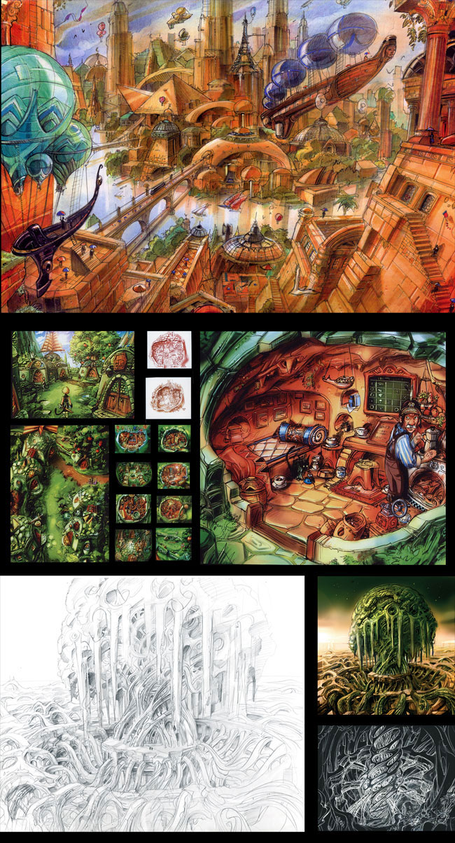
Daniel Dociu
                The most recent work of Daniel Dociu is centred on the upcoming MMORPG by ‘ArenaNet’, ‘Guild Wars 2’. ‘ArenaNet’ is one of only a few companies that encourages its artists to be involved with Art competitions within the Games Industry, including Daniel Dociu’s latest entry being shown at ‘Into the Pixel’.
Daniel Dociu grew up in Romania, which is rich with architecture influencing him at a young age, and although his parents wanted him to be a doctor, he had other plans, where he finally got a top grade in a masters degree in Industrial Design.
Speaking of ‘Guild Wars 2’, he is the Chief Art Director at ‘NCsoft’ and being highly rated among his peers, his artwork is literally the building block to the architecture within the game.
                Ever since joining the Games Industry from being freelance, he has worked as a concept artist/art director for games such as the SSX series, James Bond and Guild Wars, all of which have a concentration on architecture.
                His preferred art technique is painting on a canvas, which allows him the chance to create depth within the painting for metaphors and emotions, trying to communicate to the audience.

Christian Lorenz Scheurer

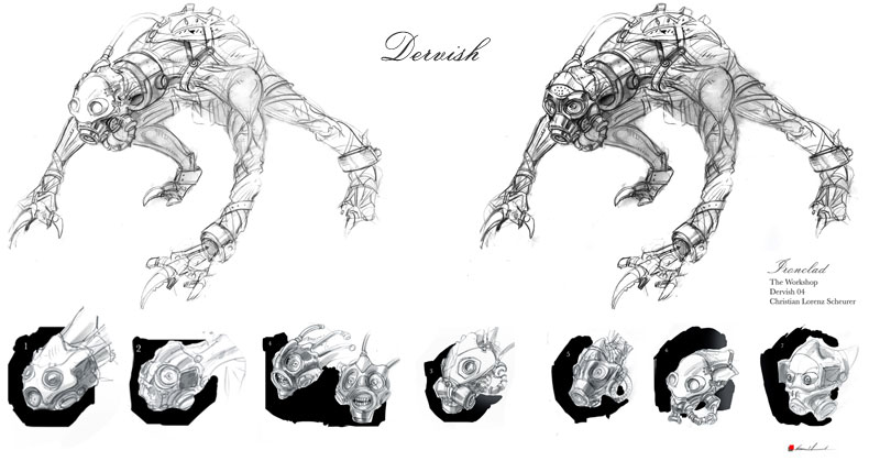
Christian Lorenz Scheurer
-      A successful lead artist and concept artist that has worked on many Hollywood movies and successful video games.
-      He has also worked on commercials, designed book covers and has helped with designs for theme park attractions. Before he worked on films and games he was a successful graphic novelist.
-      Currently working as a teacher at Art Centre College of Design (Pasadena)
-      Born in Switzerland, studied at an art academy in Brussels, Belgium.
-      First Hollywood film he worked on was The Fifth Element.
-      Has also worked on top movies such as The Matrix, Final Fantasy: The Spirits Within, Titanic and The Wolfman, as well as many more.
-      Has worked on video game titles such as Spore, Pirates of the Caribbean RPG, Final Fantasy IX, Lost Odyssey and Lord of the Rings: Return of the King.

He decided to follow a Hollywood career path after getting struck by lightening and realising how precious his life actually was so did what he always wanted to do.
Scheurer is influenced by places he gets to work in, as well as art exhibitions and unusual areas such as abandoned factories and warehouses.
He favours matte paints and does a lot of painting. He also does technical and mechanical drawings. I particularly like his concept paintings for Final Fantasy: The Spirits Within as they have great depth.
I also really like the creature designs he did for the Spore game as they are original and show the evolution of a character idea. Spore was also one of Scheurer’s favourite projects he worked on. He also enjoys observing people and drawing them and their environments.


Week 1 - Trey Parker

Task 1
Today’s task starts off with research into concept artists. This is for your journal.

You are required to research 5 concept artists or groups of artists (in the case of say a game or film). These must have all been published.

You need to cite sources of where these are found.

Each concept artist should occupy 2 double pages in your journal where you should also talk about who their influences are, how their work has influenced the game/film (illustrate), film and game-ographies their style, their art techniques (e.g paining onto 3D, arylic etc) and of course why you like them. This is not an exhaustive list talk about them. 200 words maximum.


Trey Parker

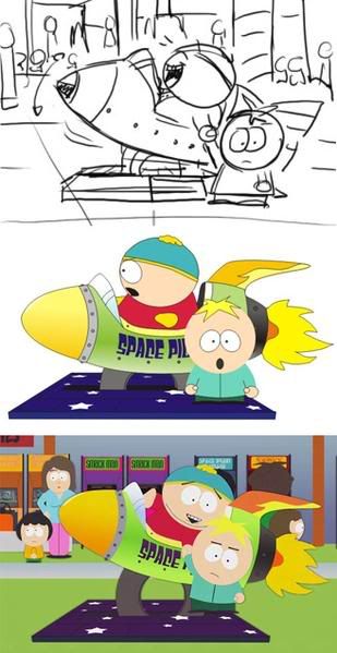
Trey Parker is most famous for co-creation of the South Park television series with Matt Stone. Although both were responsible for the series' birth, Trey parker was the main influence on the art and animation of the show. The aim of the show was to create an interesting and more involved storyline rather than focus on complicated artwork. They use Cut-out animation (one of the very early forms of animation) as their main influence. Although the style looks incredibly basic and simple, it is actually an incredibly long winded process to create changing the shapes frame by frame. The main purpose of the Art was so that viewers would focus on the characters storyline, sub-text and depth rather than focus on the visual. This primitive art style has now become a trademark for the series and is praised for its effectiveness. I personally love the design of the characters and environments because I can relate it with games. It is fascinating to see how basic colourful shapes can create a huge environment. This show alone proves that fancy animation and graphics don't make a great game or film. By creating loveable characters, deep storylines and great environments there is no need for amazing graphics. Trey parker uses the simple style as a means to communicate depth and that is why I choose him as a concept influence for my concepts. Sometimes simplicity is better.